Our product had grown through years of one-off decisions, uneven patterns, and design system false starts. The experience was functional, but it didn’t consistently feel like one product. Similar interface problems were being solved in different ways, foundations were incomplete, and the cost of maintaining consistency kept increasing as new work shipped.
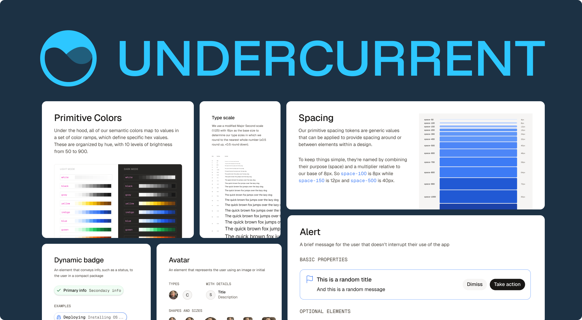
I helped grow Undercurrent into a more dependable shared system — one that could support day-to-day product work, improve consistency across surfaces, and create stronger foundations for bigger efforts like theming and dark mode.
The problem
Before Undercurrent, we had a consistency problem that was both visual and operational.
Different apps and product areas were drifting in small but important ways. Components behaved inconsistently, patterns were not always reusable, and the path from design intent to implementation was often looser than it needed to be. That made product work slower, but it also made the experience feel less connected over time.
We did not just need a component library. We needed a system that could hold up under real product use.
The approach
From the start, we wanted to treat Undercurrent as product infrastructure rather than a side library.
Instead of separating “system work” from “product work,” I approached Undercurrent as something that needed to improve through active use. That meant designing and refining components, tightening implementation details, improving theming foundations, and making the system easier for others to adopt through documentation and workflow support.
It also meant contributing across design and implementation. From the start, I designed components, submitted PRs, and wrote documentation to help build a system that was easier to extend, easier to trust, and easier for teams to adopt.
The solution
I helped shape Undercurrent as a shared system that could support immediate product needs while creating a stronger long-term foundation.
That work happened in three overlapping layers.
As the only designer to work on Undercurrent, I was responsible for shaping
its shared UI from the ground up. That included core components like Card,
Slider, and TextField, along with the patterns and visual decisions that
made the system feel cohesive. That work did not stop at initial design. I
continued refining the system over time, improving weak spots, resolving
inconsistencies, and tightening the details that made the library more
dependable.
I also helped strengthen the system through theming work across typography, color behavior, brand themes, and dark-mode-related issues. That work made Undercurrent more adaptable over time and created stronger foundations for broader visual change across products.
A large part of my focus has been helping make Undercurrent more usable through documentation, implementation support, and stronger design-to-development alignment. That’s included work like Storybook documentation and a large amount of Code Connect-related effort across many components and patterns. That work helped make the system easier to understand, easier to adopt, and more dependable over time.
- Extended MUI components — add functionality to MUI components (e.g.
Buttonwith a loading state) - Custom components — project-specific components (e.g.
Counter,Note) - Re-exported MUI components — MUI components exported directly with theme customizations (marked with an asterisk *)
- Consistent theming — a unified visual language across all components
- Responsive design — components that work seamlessly on all device sizes
- Accessibility — built with accessibility in mind, following WCAG guidelines
Why it worked
As the system became more complete and more reliable, it created a shared foundation for teams working across different apps and product areas. It improved consistency across experiences, reduced implementation drift between design and code, and made it easier to scale product work across surfaces with more confidence.
One of the clearest lessons from the work was that the value of a design system is not just in the library itself. It is in how well that library holds up when teams actually depend on it.
Key takeaway
A design system becomes meaningful when it improves the product, not when it grows in size.
We created (and are still creating) a system that is more structured, more usable, and more trustworthy, while making the experience within our product feel more connected over time. That’s more valuable than any individual component.
Project status
It has expanded over time through component work, theme and typography improvements, documentation, Code Connect support, system polish, and ongoing stewardship across multiple product surfaces.